Exploring Google Trends’ Explore function: finding keywords and queries
Google is the search engine king of the internet (sorry, Bing), and as many content marketers know, Google likes to keep track of these searches with Google Trends. A godsend of hidden gems for marketers and SEOs, Google Trends’ Explore function allows people to compare search queries to see which query is more popular. While it was created for the general public to take a look at what’s popular and what’s not (take a look at their years in search—super cool!), it’s also the perfect tool for researching queries and keywords that are otherwise difficult to find.
It’s a powerful tool for anyone looking to find the right queries and keywords and can give their site a highly-coveted SEO boost. But as great as the tool may be, it can’t do everything (I’d like to emphasize that before we get too deep into the topic). Most importantly it doesn’t do the following:
- It doesn’t give you any “hard” numbers on volume or search frequency. Trends data is normalized so that it’s relative, not absolute. Essentially, Trends tells you (approximately) how much more often a query is used compared to another query, but not the actual number of times a query is used. Google offers a great explanation on their Trends Help Page.
- It doesn’t give you much of a jumping off point. To really reap any keyword benefits from Trends, you need to have at least a couple of keywords in mind. For most businesses, this won’t be an issue, but for a small business trying to find their footing, it can be a bit of a struggle. We’ll look at some potential solutions later on in this post.
- It doesn’t give you results that are overly specific. Trends data only shows popular terms, and terms that are rarely searched will bear no data. This is probably for the better as terms with low search volumes are unlikely to be representative of the general population. As a rule of thumb, I like to start general and get more granular as needed since general results tend to help inform which details to look into.
If you want to master the tool, keep reading. I’ll start from the top of the page and address each feature.
Getting started: the top bar
The top bar offers some filtering functionality—namely location, time frame, and search category. You can also choose to filter based on image, the web, news, shopping or a YouTube search. For the purpose of this post, let’s stick with a web search. If you click the three dots on the far right, there’s also an option to export your search as a .csv file for further analysis.
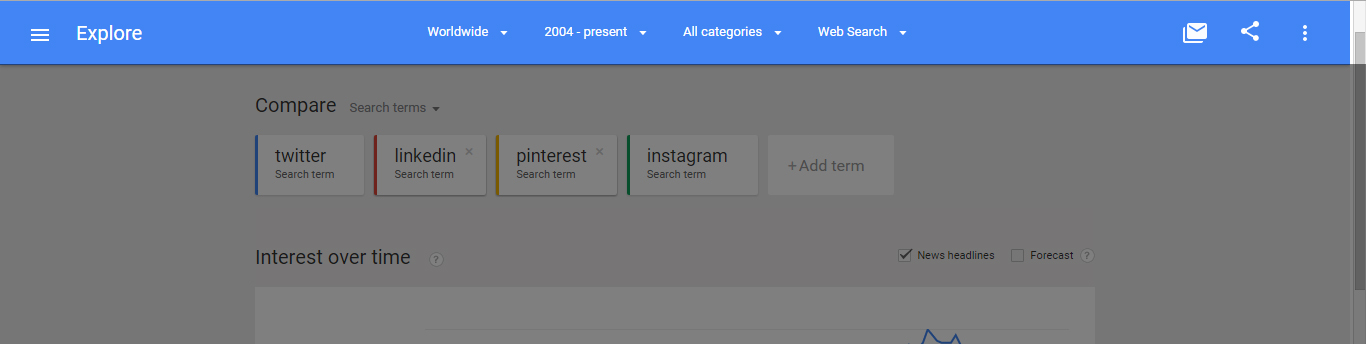
For any trend search, (at the very least) filter the time frame to something more relevant than “2004-present,” since the world has changed a bit since ’04. Generally, the widest time frame should be no more than three years, which gives enough of a snapshot to show any patterns that occur annually while still returning results that are relevant.
If your target audience or your business is located in a particular location, it’s usually a good idea to filter your search by location. It’s important to note that when filtering by location, you’ll get results coming out of that area, not results searching for that location; this is actually one of the features that makes Google Trends such a powerful tool, since it allows you to filter down to a state/region level (depending on country) to get more specific results.
Finally, you can select a category with which to filter your search. This filter is perhaps the most valuable, especially since there are queries that are used across industries and across topics. Filtering by category returns only the results that are relevant to you. For example, searching “shop” with no filter might return generic terms like “online shop” or “free shop” or whatever is popular to the internet population at large. Transfer the same term to the “Autos & Vehicles” category and you’ll see results like “bike shop” and “auto shop,” which is much more useful when looking for keywords.
This same process is also useful for narrowing down words with multiple meanings. Search for “pot” with no filter, and you’ll find results related to cooking. Filter that search in the “Health” category and suddenly “pot” returns queries related to medical marijuana. The great thing about the category filter is that it also allows you to get extremely granular—within each category are sub-categories and within some sub-categories there are more specific topics. To see which queries are most popular within each category, simply choose a category and hit search without specifying a query.
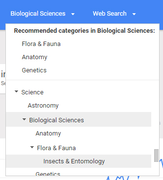
As with all filters, you have to be careful with how granular you get. The more filters you add, the more likely it is that your search will yield no results, meaning that your search is too specific. There’s simply not enough search traffic for your specific query to net any meaningful results. The best course of action, in this case, is to take a step back and use less granular filters. For locations, once you get more specific than the state level, your results become limited unless your searches are extremely popular or general. As for categories, it varies more, but generally sub-categories start returning spotty results.
Comparing search terms
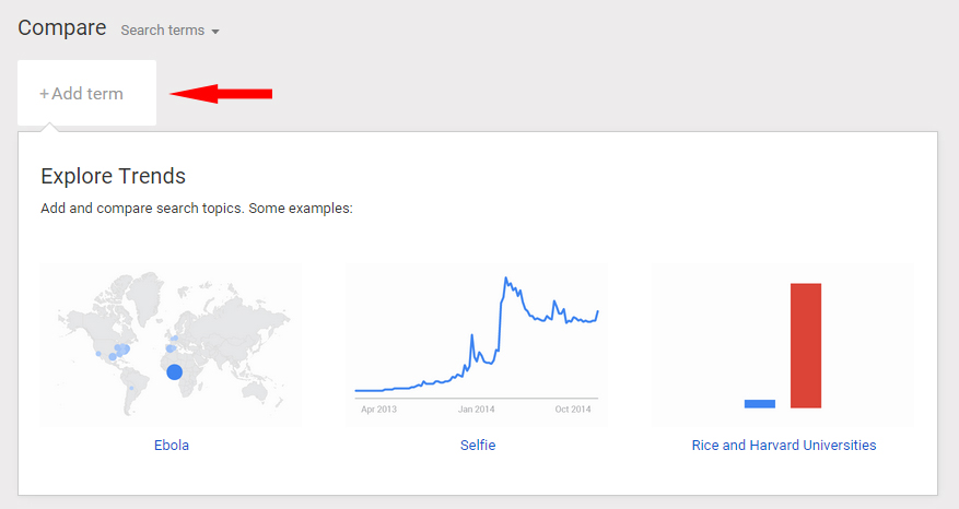
Once you have your filters set up, it’s time to get to the meat of Google Trends’ tool—comparing search terms. Start by clicking the “+Add term” box, and enter a search term you want to dig deeper into. Start with a general term since you can always get more specific later on. You can also use certain search operators to refine the terms you compare.
When typing in your term, you’ll be presented with a list of autocomplete options, some of which will be classified as search terms, whereas others might be listed as part of a topic. The difference is that topics will include all search terms related to it whereas search terms are specific and results will only show the relative volume of the term. To put it another way, topics are a collection of search terms. If you’re having trouble identifying search terms or aren’t getting any results with your chosen terms, it’s a good idea to search with a topic instead.
Once you enter a term, you’ll notice that the entire page automatically updates, showing an “interest over time” section that shows the relative volume of each term over time, which can provide some valuable insights:
Trends over time
The graph makes it easy to see if there are any recurring patterns in the search term. Depending on your selected timeframe, you can easily see when terms are more (or less) popular. For example, searches for “school supplies” tend to spike in August. Although this type of insight might seem obvious, it’s useful in that it can help validate any assumptions you’ve made, as well as identify previously unknown patterns for further investigation.
Volumes of search relative to other terms
When comparing more than one term, you’ll notice that more datasets are added to the graph. This provides a great snapshot as to how certain search terms perform compared to others. If you’ve filtered for a category, a “compare to category” checkbox will appear, which functions exactly as you’d expect, adding a line for the average search volume in the category. It then compares your terms to the average, making for a great benchmark for industry search terms.
While this visualization is great to use, there are instances where it’s much less effective. For example, if you have one term that is searched much more than others, it’ll skew your results and clump your other terms together, making the results less useful:
In this case, it’s best to remove the outlier (in this case, Facebook) and compare it separately on another trend search. After removing the outlier, your data becomes much more useful.
If you find that your data is still clumped and obscured, use the bar chart to find which term is searched more, which is located on the left-hand side. This represents the average indexed value (0–100) of each search term, compared to the highest value in the graph (100). This allows you to identify which terms, on average, perform better. To compare points that are very similar in volume at one point in time, simply hover your cursor over the data point, and a box will pop up, showing the value of each term at that point in time.
Anomalies
From time to time, you’ll also encounter spikes and dips that don’t fit within an established pattern. These anomalies can be extremely insightful when probed a bit deeper. Was there a one-time event or news story that caused a spike in search? Perhaps certain videos or articles went viral to prompt a large surge in search traffic. Identifying these types of events could help you predict how search might spike the next time something similar occurs.
Sometimes, however, it’s difficult to accurately pinpoint what caused the spike. This is where the news headlines option comes in handy. If you check the box, letters will pop up along the timeline (shown above). If you hover your mouse over each letter, it will show a major headline at the time. Now, this tool is hardly the authority on major headlines, and doesn’t always give you the most accurate headline associated with the data on hand, but it’s a great place to start your search if you really can’t figure out why there’s an anomaly.
Regional Interest
This section is a neat feature that shows which countries (or states/provinces and regions, depending on your location filter) have the most affinity towards each search term. The way this is measured is slightly different compared to how search terms are ranked. Instead of highlighting which regions have the highest volume, the data is normalized such that the highest number of searches divided by some variable (I’m assuming it’s either by search volume or per capita; Google doesn’t state this explicitly) is highlighted. This way, we can tell whether a large portion of people in each given area is interested in a specific topic, rather than having the data skewed by areas with the highest search traffic.
This data normalization is actually what makes this feature so powerful. Using this location data, it’s easy to identify regions where marketing and SEO efforts can be reinforced, as well as to discover smaller areas that hold an interest in the products/services your company offers.
Related Searches
The final section of a Google Trends search is the Related Searches section. This is my favorite part, and related searches is probably the most powerful section in this tool. You’ll likely find yourself spending lots of time digging through this section. So what exactly does Related Searches do? It shows queries (not keywords) that are related to the terms that you entered. For example, if I entered “SEO” as a search term, Google Trends returns “SEO Google,” “Web SEO,” and “SEO WordPress” as related queries. The great thing about getting queries from Trends rather than keywords is that this information isn’t easily found elsewhere, unless you’re looking for queries related to a site that you run. With these queries, you can generate your list of keywords, or even negative keywords for properties you don’t currently operate, or clients if you’re an agency. Use Google Trends along with Google’s Keyword Planner tool, and you’re set for just about any campaign you might encounter.
At this point, you might have noticed that there’s an option to dig deeper into “top” and “rising” queries. Top queries are the most popular within the search parameters that you’ve defined. These are your evergreen queries and tend to stay relatively consistent across time periods. If you’re looking for queries or keywords for evergreen site content, use “top” and “rising” queries.
Rising queries are a bit more interesting. Instead of including an index number, there is a percentage or “breakout” associated with each query. This percentage indicates the increase in searches for this query in the time period you’ve defined, compared against the previous time period. If it says “breakout” it means that the increase is above 5000 percent.
For example, if you’re looking at the term “bacon” for the month of May 2015, the percentage would be based on the change from April 2015 to May 2015. Essentially, they’re queries that have become the most popular since the last defined period.
This is really useful if you’re looking for queries that are highly relevant and time sensitive. Rising searches make it possible to find out what’s up and coming, without being tainted by noise of the evergreen searches that are always there. This lets you keep your finger on the pulse of what’s happening, and can be a great starting point to generate blog post or story ideas for your blog or website.
4 final tips for finding relevant terms to search for
Finally, we come full circle. As I mentioned at the very beginning of this post, it can be hard to come up with a relevant term to start your search, particularly if you (or your client!) are in a very specific niche. Here are some general tips to help you get the ball rolling.
- Start with the categories: if you’re really stumped, go through Google Trends’ list of categories and find ones that are related to your topic at hand. Chances are, there’ll be at least one topic that is relevant. Filter by that category, and take a look at what related searches pop up right off the bat.
- Search your results: from those results, try doing a Trends search on the more general queries. Usually, this will return more, specific related queries. Rinse and repeat until you get too specific.
- Search topics: if you feel like you’ve run out of terms to search, try searching for topics instead. As mentioned earlier, topics incorporate a wide range of search terms, and can return terms you never thought of.
- Don’t be too picky: at the end of the day, Google Trends shows you what people are searching. It could turn out that people aren’t searching for your exact product or service–and that’s okay. Find similar search terms, and take this as an opportunity to educate your audience!
That’s it! If you’ve read this post from top to bottom, you’ll be a pro at navigating Google Trends. Of course, there are tons of little intangible details to be explored—the results and techniques for every niche is different—and you’ll need to find out what works best to achieve your objectives. However, this post should give you everything you need to get started and go digging for those valuable keywords and insights.
Happy searching!
Image: Christian Wiediger/Unsplash